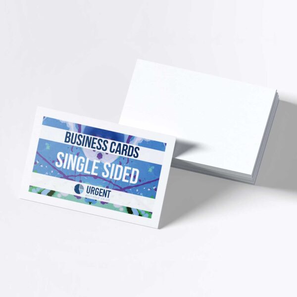
Business Cards & Stationery
Business Cards and Stationery Essential Tools for Professional Branding
Business cards and stationery remain essential elements of professional branding for organisations of all sizes. They provide a tangible way to leave a positive impression, making every interaction more memorable and helping to reinforce a company’s identity. Whether at networking events or routine meetings, well-designed stationery and business cards demonstrate attention to detail that clients and partners notice.
In today’s competitive market, consistency and quality across all printed materials signal reliability and professionalism. Customisation options, such as logos, monograms, or personalised patterns, allow businesses to create a distinct and cohesive image that stands out.
Selecting the right materials and designs for business cards and stationery is a practical step towards building brand recognition. Investing in high-quality printed items can help establish credibility while supporting everyday communication needs.
Understanding Business Cards and Stationery
Business cards and stationery play a significant role in everyday business communication. These materials help create a consistent brand presence and support professional interactions both within the company and with external parties.
Definition and Purpose
Business cards are small, printed cards that provide essential contact information such as name, title, company, phone number, and email address. They are typically exchanged during formal introductions or networking events.
Stationery refers to a range of printed materials that businesses use, including letterheads, envelopes, compliment slips, and notepads. Each piece of stationery serves a specific purpose, such as sending letters to clients, issuing invoices, or providing written notes.
The main objectives of business cards and stationery are to facilitate communication, convey professionalism, and reinforce the company’s brand identity. They create a tangible representation of the business and help build initial trust with clients, suppliers, and partners.
Evolution Over Time
Traditional business cards and stationery were usually designed with basic information and simple layouts. Over time, design choices have become more refined, incorporating brand colours, logos, and unique graphics to distinguish one business from another.
Advancements in printing technology have expanded the options available. Varieties now include textured paper, embossing, metallic accents, and eco-friendly materials. Businesses can select these features to reflect modern values, such as sustainability and attention to detail.
The way business cards are used has also changed. While digital contact sharing is common, physical cards and stationery remain relevant as they offer a personal and memorable touch that digital alternatives often lack.
Role in Modern Branding
In modern branding, business cards and stationery act as visual elements that carry the essence of a company’s identity. A well-designed card or letterhead displays consistency through fonts, colour schemes, and layout, signalling professionalism and reliability.
Having cohesive stationery across all printed materials reinforces the company’s message every time a client or partner receives a letter or business card. These materials also help smaller businesses compete by making them appear more established and trustworthy.
Key features often include a prominent logo, clear contact details, and strategic use of white space. These elements work together to create a positive impression and ensure the company stands out in a competitive market.
Design Principles for Business Cards
Effective business card design depends on precise dimensions, clear typography, appropriate colour choices, and consistent branding. Each element must contribute to readability, professionalism, and brand recognition.
Standard Dimensions and Layout
The standard business card size in the UK is 85mm x 55mm. This fits easily in wallets and card holders. Deviating from these dimensions can lead to cards being discarded or damaged.
Layout should prioritise visual flow: the viewer’s eye typically starts at the logo, moves to the name, then contact information. Margins and bleed areas (usually 3mm) are necessary for clean edges after printing.
Essential details include the recipient’s name, job title, company, phone, email, and website. Consistent alignment and spacing give the card a professional appearance. Avoid clutter by including only necessary information and ensuring there is enough white space.
Typography and Colour Choices
Typography impacts readability and brand perception. Sans-serif fonts such as Arial, Helvetica, or Open Sans are common for their clean lines. Font size should be at least 7pt for contact information and 9-11pt for names or titles.
Consistent use of two font styles or weights (e.g., bold for names, regular for details) helps guide the reader. Avoid using more than two fonts to maintain clarity.
Colour choices should align with the brand and suit printing processes. High-contrast combinations, like dark text on a light background, are easier to read. Refrain from using colours that clash or make text difficult to distinguish, and ensure colours look accurate both on screen and in print.
Incorporating Company Branding
Company branding must be visible and harmonious throughout the business card. The logo should have a prominent but not overwhelming position, typically in the top-left or centre. It must be high-resolution to prevent a pixelated look after printing.
Use brand colours and fonts to strengthen identity. Any brand patterns or secondary marks should be subtle so as not to overpower contact information.
Include a tagline or slogan only if space allows and it adds value. Branding elements should be consistent with other stationery and marketing materials to promote a unified and competent image.
Types of Business Cards
Business cards vary in material, style, and technology, offering solutions that suit different professional needs. Options range from classic paper formats to newer digital alternatives, each with distinct features and benefits.
Traditional Paper Cards
Traditional paper business cards are the most recognisable type. They are typically printed on cardstock, with common weights including 400gsm or 450gsm. Paper cards are valued for their tactile feel and straightforward presentation, helping make a professional first impression in face-to-face settings.
A wide range of finishes is available, such as matte, gloss, or silk. Standard shapes are rectangular, but square and other custom shapes are also popular.
Most printing companies offer options for full-colour printing, embossing, and spot-colour effects. These features enable individuals and companies to represent their brand identity clearly.
Digital Business Cards
Digital business cards use technology to share contact details electronically, usually via smartphone apps or web platforms. They offer quick updating and can be sent instantly through QR codes, links, or direct messages.
Key advantages include reduced printing costs, environmental benefits, and the ability to include dynamic content like videos or social media links. Digital cards are accessible on multiple devices and easy to store.
For networking in tech-driven industries or remote environments, digital business cards provide flexibility and up-to-date information sharing. They support seamless integration with digital address books and customer relationship management systems.
Stationery Design Elements
Effective stationery communicates brand identity through considered design choices. Focused attention to layout, typography, colour, and material instantly creates a professional impression with recipients.
Letterheads
Letterheads serve as the cornerstone of business correspondence. They should clearly display the company logo, business name, and contact information, typically at the top of the page. Using consistent fonts, colours, and spacing helps maintain brand integrity.
White space is crucial in letterhead design to ensure the content stands out and the document remains easy to read. Popular sizes include A4 for most UK businesses. Security features, such as watermarks or embossed elements, add credibility and help protect against counterfeiting.
Paper quality influences perception; thicker, smooth paper stocks tend to look more professional. A summary of key features:
Element | Consideration |
---|---|
Logo Placement | Top-centred or left-aligned |
Contact Info | Top/bottom margins |
Typography | Clean, corporate fonts |
Colour | Brand-specific, restrained palette |
Compliment Slips
Compliment slips provide a personal touch for informal or brief communication. They usually contain the company logo, a concise message (such as “With Compliments”), and the essential contact details. Their size is often one third of an A4 sheet for convenience.
Design must be minimal to leave sufficient space for handwritten notes. Matching paper stock to letterheads and envelopes maintains consistency across the stationery suite. Compliment slips reinforce brand presence while still being flexible for various uses.
Important points include:
- Essential elements: Logo, “With Compliments”, key contacts
- Consistent design: Mirror letterhead and envelope style
- Format: DL size is standard in the UK for easy envelope fitting
Printing Techniques and Materials
Selecting the right combination of printing technique and material can greatly influence the impression a business card or piece of stationery leaves. Decisions made here can set the tone for brand perception and long-term durability.
Paper Stocks
Paper stock determines the feel, weight, and stiffness of a business card or stationery. Common options include standard silk, gloss, and matte finishes. Textured stocks like linen or laid paper add a tactile dimension, while premium heavyweight cards provide a more substantial presence.
Most printers offer a variety of thicknesses, often measured in GSM (grams per square metre). Higher GSM gives a sturdier, more luxury impression but can increase costs. Card stocks can be uncoated, coated on one side, or double-sided, each affecting print vibrancy and how the card handles ink.
100gsm Uncoated (A4 & A3 only)
120gsm Uncosted SRA3
300gsm Uncoated SRA3
A premium, ultra-smooth white paper, offering excellent colour reproduction for graphics and images. Image Impact Plus is FSC accredited for sustainability and is guaranteed for 200 years + for archiving purposes.
Image Impact Plus: an ultra-smooth, premium multifunctional quality uncoated paper offering a brilliant white surface to deliver excellent colour reproduction for graphics and images. Perfect for the offices and for commercial printing jobs.
Image Impact Plus utilises ColorLok® technology, specifically optimised for inkjet printing: papers awarded with the ColorLok® logo produce the best possible digital prints, featuring more saturated colours, bolder blacks, and faster drying times.
The Image Impact Plus paper is environmentally friendly - FSC® and ECF certified, awarded with the EU Ecolabel - and guaranteed for more than 200 years for archiving purposes.
- Premium quality, extra smooth paper
- Extra white paper
- FSC Certified
- EU Ecolabel certified
- Colorlok certified
- Suitable for Digital Printing
- Relevant Techniques
130gsm Silk SRA3
150gsm Silk SRA3
300gsm Silk SRA3
400gsm Silk SRA3
Novatech Digital Silk is the impeccable partner when you want to impress your readers with perfect colour reproduction of your message. Its market leading whiteness, smoothness and silk coating produces flawless images, and its advanced coating ensures precise and faultless runnability on your HP Indigo and dry-toner machines. The Silk coating's low reflection enhances the image and improves the readability.
It is available in most digital size and grammage requirements, allowing Novatech Digital to fulfil all you coated digital needs.
Novatech Digital is both FSC Certified and PEFC certified It is also recyclable.
Key Features
- Specially designed for high-quality dry-toner digital printing
- Enhanced opacity
- Perfect colour reproduction
- Excellent runnability
- FSC and PEFC Certified
Environmental Information
- FSC ® certified
- Heavy metals certificate (94/62 EC)
- PEFC
- ISO 14001
- EMAS
- ECF
135gsm Nautilus Classic Recycled SRA3
300gsm Nautilus Classic Recycled SRA3
A combination of an authentic recycled paper shade with a strong environmental profile. Nautilus Classic has a unique surface for ink density and sharp detail, it allows double side printing with no show through due to its high opacity.
- Hybrid Printing Technology
- Colorlok Technology
- FSC Recycled Certified
- EU ecolabel
- Blue Angel Certification
- 100% Post-consumer recycled paper
- 5 Green Star System
160gsm Super Smooth Uncoated SRA3
350gsm Super Smooth Uncoated SRA3
Xerox Colour Tech Plus Uncoated papers specially developed for colour laser printers, copiers and digital colour presses, this product produces beautiful images and crisp text
- Excellent level of whiteness
- High opacity and smoothness
- High level of stiffness
- Excellent dimensional stability
- Tested and approved by leading equipment manufacturers
- FSC® & EU Eco Label for environmental peace of mind
300gsm Super Smooth Uncoated Card SRA3
Uncoated papers specially developed for colour laser printers, copiers and digital colour presses, this product produces beautiful images and crisp text
- Excellent level of whiteness
- High opacity and smoothness
- High level of stiffness
- Excellent dimensional stability
- Tested and approved by leading equipment manufacturers
FSC® & EU Eco Label for environmental peace of min
400gsm Ivory Board SRA3
Uncoated paper with a superior whiteness (CIE 161) for perfect reproduction of colours, uniform surface and ultra-smooth finish for optimum runnability, and a natural feel to the touch.
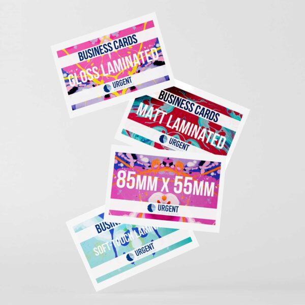
The exceptional bulk level and opacity offered by its content of Eucalyptus fibre allows duplex printing (double-sided) with no show-through.
Superb unique combination of coating, opacity, whiteness and printing performance ideal for advertising materials, annual reports, books, brochures, catalogues, dictionaries, direct mailing, guides, leaflets and notebooks.
Eco-friendly FSC® and ECF certified, compliant with ISO 14001, ISO 9706, ISO 9001.
Key Features
- Warm Ivory shade
- High bulk and opacity
- Excellent smoothness
- Excellent printability
Eco-Friendly Options
Eco-friendly printing options have grown in both availability and quality. Many suppliers now offer recycled stocks, often made from post-consumer waste or sourced from FSC-certified forests. Bamboo and cotton papers provide alternative fibres that are both renewable and biodegradable.
Soy-based or vegetable-based inks are increasingly used as a replacement for traditional petroleum-based inks, reducing environmental impact. Some printers use waterless or digital printing techniques to cut down on chemical use and paper waste.
It is also possible to select minimalist, uncoated stocks and simple ink choices to reduce environmental footprint further. Customers should look for cards and stationery that specifically mention recycled content and environmentally responsible production.
Best Practices for Consistent Stationery Branding
Consistency in business stationery plays a major role in shaping brand perception. Key elements include careful logo positioning, strict adherence to approved brand colours, and the use of unified templates across all materials.
Logo Placement
Proper logo placement is crucial for reinforcing a brand’s identity every time stationery is used. The logo should appear in a prominent yet balanced position, usually the top left, top centre, or sometimes bottom right, depending on the stationery type.
Clear space guidelines should be enforced to avoid crowding the logo with other text or design elements. Maintaining the logo’s original scale and avoiding distortion is essential to protect its integrity. Using high-resolution files prevents pixelation and maintains a professional look.
On items like business cards, letterheads, and envelopes, ensure the logo maintains the same relative position and size. This familiarity helps clients and partners instantly recognise the brand across all communication.
Maintaining Brand Colours
Using a consistent colour palette is essential for brand recognition. Only official brand colours should be used, with exact CMYK, Pantone, or RGB values provided to designers and printers. This avoids unwanted shifts in tone between digital and printed materials.
A brand colour table can help ensure uniformity:
Colour Name | Pantone | CMYK | RGB | Hex |
---|---|---|---|---|
Primary Blue | 286 C | 100 75 0 0 | 0 56 168 | #0038A8 |
Accent Yellow | 116 C | 0 18 100 0 | 255 209 0 | #FFD100 |
Avoid using tints or shades outside the approved palette. This level of precision protects the visual identity of the brand and helps all stationery elements feel connected.
Template Usage
Templates ensure all business stationery aligns with established brand standards. They should include locked-in layouts for logos, text zones, and consistent margin spacing across documents.
Centralised templates are best managed in shared folders or brand asset libraries, making it simple for staff to access the correct files. Including sample content within templates helps users understand desired font sizes, line spacing, and text alignment.
Templates also enable easier updates and control, so any future changes to branding can be implemented uniformly without manual redesign. This reduces errors and ensures that every printed and digital item matches the brand’s identity guidelines.
Using Business Cards and Stationery Effectively
Business cards and stationery are practical tools that help businesses share contact information, reinforce brand identity, and communicate professionalism. Their impact is strongest when used with clear intent and attention to detail.
Networking Opportunities
Business cards play a significant role in networking settings, such as industry events, client meetings, and conferences. When exchanged, they leave a tangible reminder of a conversation, making follow-ups simpler and more personal.
Quality matters. Professionally printed cards with accurate contact information, brand-aligned design, and a readable font make a better impression. Consistency between business cards and other stationery helps strengthen brand recognition.
It is helpful to carry cards at all times and to hand them out selectively. Giving a card at the right moment demonstrates preparation and respect for the recipient’s time. A good practice is to jot down a short note on the back when relevant, such as where or why you met.
Professional Correspondence
Letterheads, compliment slips, and branded envelopes project reliability and credibility when communicating with clients, partners, or suppliers. Formal correspondence on branded stationery signals attention to detail and helps validate the sender’s identity.
Businesses should ensure that all stationery items contain up-to-date contact details and a consistent visual style. Using stationery for important communications, contracts, quotes, or thank-you notes maintains a polished image.
Personalised touches, like handwritten notes on branded paper, can increase the perceived value of a message. Choosing high-quality materials reflects positively on the company, while clarity and layout keep communications easy to read.
Innovative Trends in Business Cards and Stationery
Technology has influenced the evolution of traditional business cards and stationery, leading to new, interactive features. Customisation continues to play a significant role, letting professionals create items that reflect their identity and values.
Augmented Reality Features
Augmented reality (AR) is increasingly found in modern business cards and stationery. By incorporating AR, users can scan a card or letterhead with their phone to access videos, websites, or interactive portfolios. This digital layer transforms a static printed item into a portal for deeper engagement.
AR features often use triggers such as logos, QR codes, or unique images. Businesses in creative sectors benefit most, as AR showcases their work with minimal physical space. A growing number of printing services can assist in developing these cards, making AR more accessible.
Example AR Uses | Description |
---|---|
Video Introductions | Introduce yourself via short clips |
Portfolio Showcases | Display design or art samples |
Direct Website Links | Take leads instantly to your website |
Companies should ensure supporting platforms and applications are widely available, so recipients can experience AR features without technical barriers.
Personalisation Techniques
Personalisation methods now extend beyond just adding a name or title. Businesses regularly use techniques such as coloured edges, embossed or debossed designs, and custom illustrations to create memorable stationery.
Personalisation can also involve variable data printing, where each card or note has unique information or imagery. This makes every piece distinct, increasing its perceived value.
- Coloured edges offer a subtle yet impactful way to distinguish cards.
- Embossing and debossing add tactile interest and emphasise important brand elements.
- Creative QR codes link directly to digital portfolios or social profiles.
Sustainable materials and finishes, like recycled papers or soy-based inks, further personalise stationery while reflecting company values.